Finding
How I Built a Fabric App on 1,851,282 Flights
Every report I build is shaped by what the visual lets me set.
Not what the data can say. What the properties expose.
So I built the same kind of answers as a Fabric App instead. Fabric Apps are in preview. Here's how it went.
The data
Public, so anyone can check it. US domestic flights from the BTS on-time performance files, May to July 2026. 1,851,282 flights, loaded into a Lakehouse and exposed through a semantic model. The app reads that model live. Nothing is copied into it.
How I built it
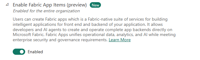
- 1.Turned on the tenant setting."Enable Fabric App Items (preview)" in the admin portal.
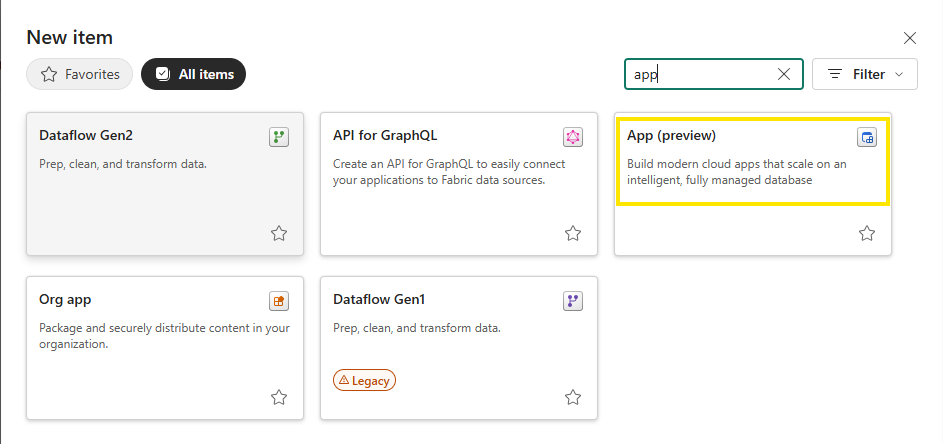
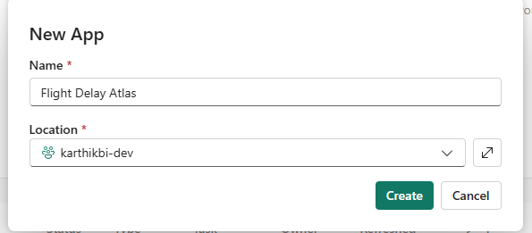
- 2.Created the item. In the workspace, New item, then App (preview). I named it Flight Delay Atlas.
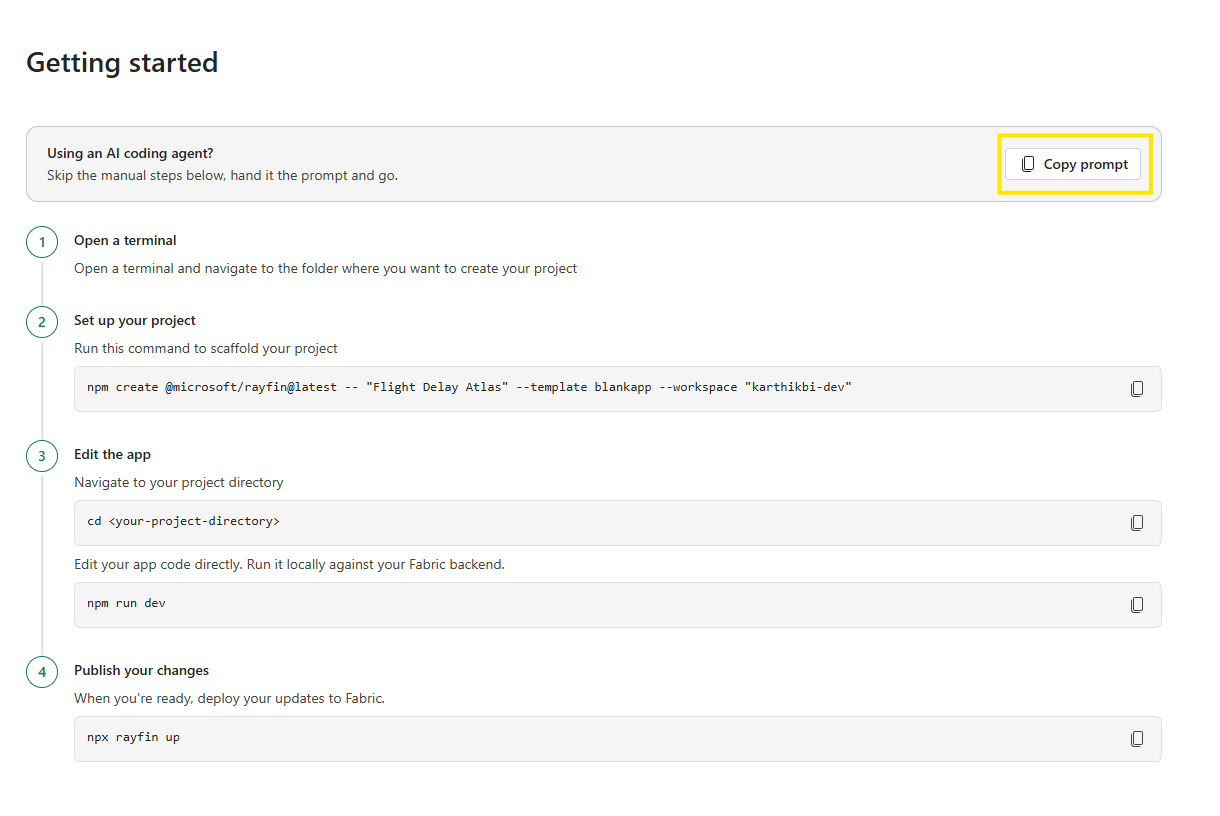
- 3.Used the prompt it gives you.The item page has a "Copy prompt" button for AI coding agents. I pasted it into Claude Code. It scaffolded the project, started the dev server and created the backend item in my workspace. From creating the item to a running dev server: about 11 minutes.
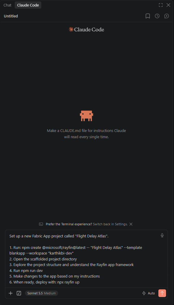
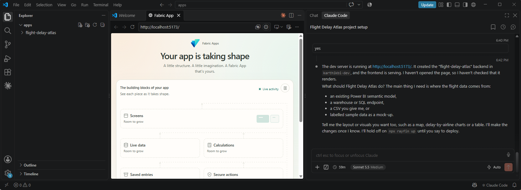
First run, about 11 minutes in - 4.Told it where the data was. I gave it the name of my semantic model, the table and column names, and the measures. It attached the model as a connector.
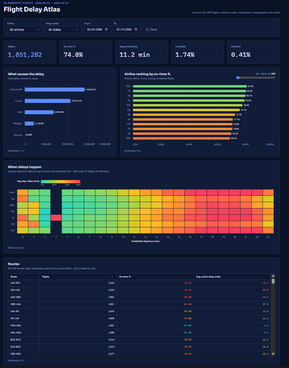
- 5.Phase 1: the report-style part. KPI row, delay causes, airline ranking, a day-by-hour heatmap, a route table, and filters that every visual responds to. About 20 minutes.
- 6.Phase 2: the web-only part. About an hour.
- 7.Deployed.
npx rayfin up.
Clock time from creating the item to the deployed app: about an hour and 40 minutes, with a few breaks. Not a benchmark.
The prompts
Two rules did most of the work:
- Aggregate in the model. Never pull raw rows into the browser.
- Keep a build log: what you tried, what broke, the fix.
I also asked it to plan first, and to check each feature in a browser before telling me it works.
What phase 2 added
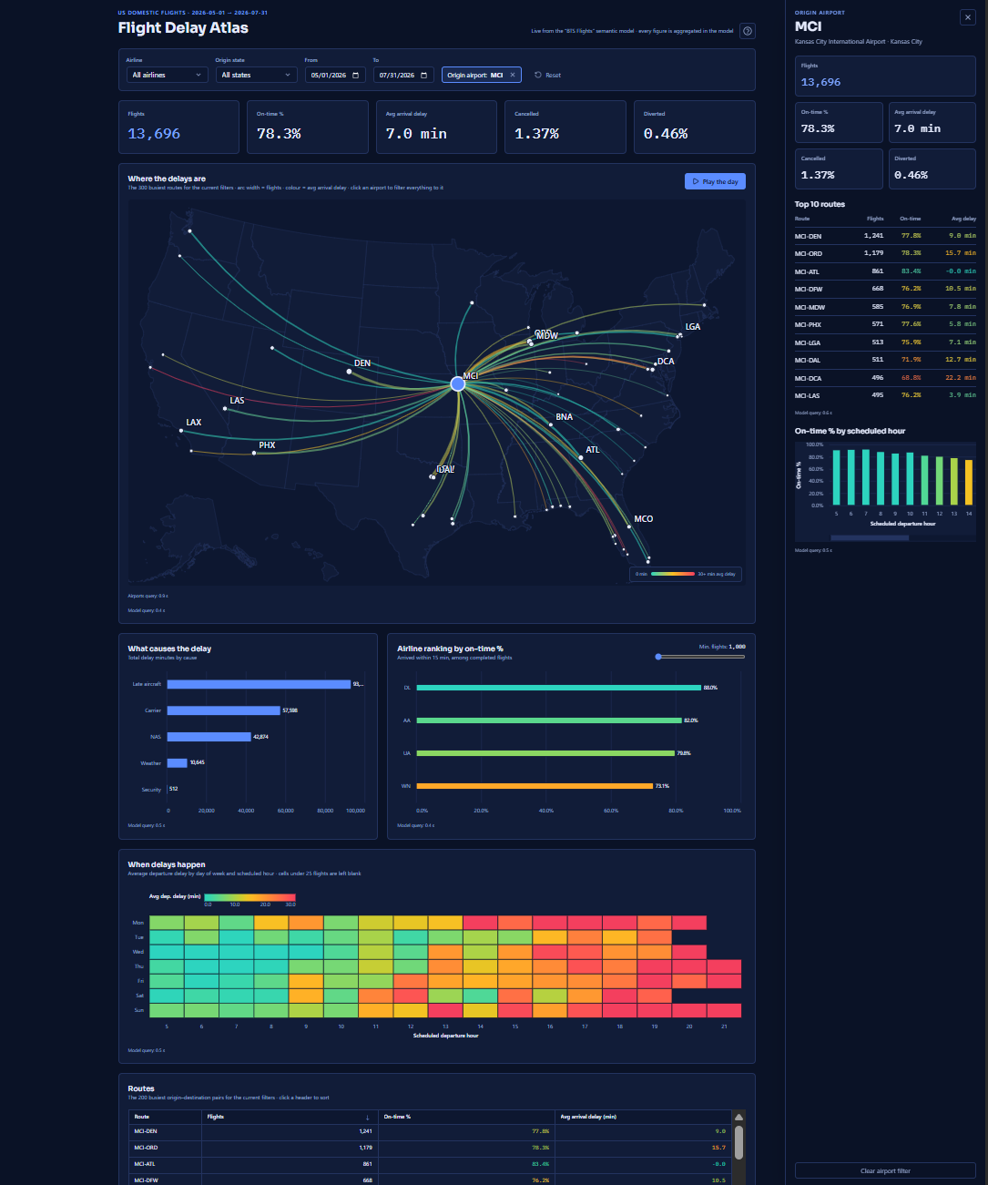
- A US route map with the 300 busiest routes as arcs, coloured by average delay, no map tiles
- Click an airport and the whole page filters to it, with a side panel for its top routes and on-time % by hour
- Filters live in the URL, so a copied link opens the same view
- Keyboard shortcuts, and a phone layout
- A "Play the day" button that animates flights along the arcs hour by hour
Overall: 74.8% on-time, 11.2 min average arrival delay, 1.74% cancelled, 0.41% diverted.
One thing that broke
Connectors don't run under rayfin dev. My page showed Connector 'bts-flights' is not declared. The docs say to test via rayfin up. I had Claude Code add a dev-only bridge to keep iterating locally, and removed it before the final deploy.
What I liked
The speed. I could create it, not just mock it.
And the freedom. In a report I'm limited to what's available: the visuals, their properties, the size they allow. An app is a normal web app, so I'm wide open to anything a web app can do.
In a report, I work with what's available. In an app, I can do anything a normal web app can.
I also think a stronger model makes this faster. That's a belief, not something I tested.
Caveats
- Fabric Apps are in preview. Things will change.
- The hosted app needs a Fabric sign-in, so I can't link it for you to click. Screenshots and a short recording instead.
What I take from this
- A report limits you to what's available. An app is a normal web app, so you're wide open. That also means you own the testing and the deploying
- Give the agent the schema and the rules, not just the goal
- "Works in dev" proved less than I wanted. Deploy early